

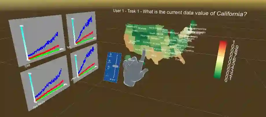
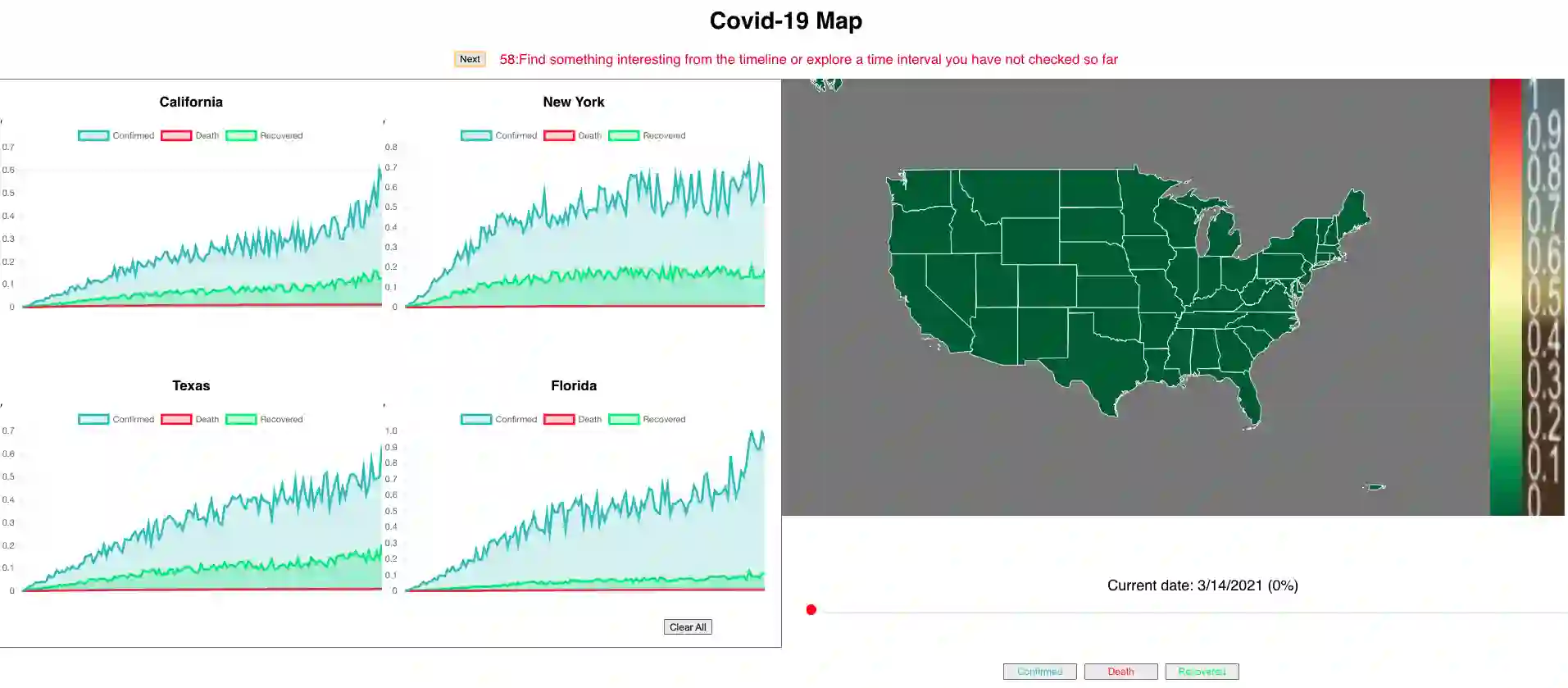
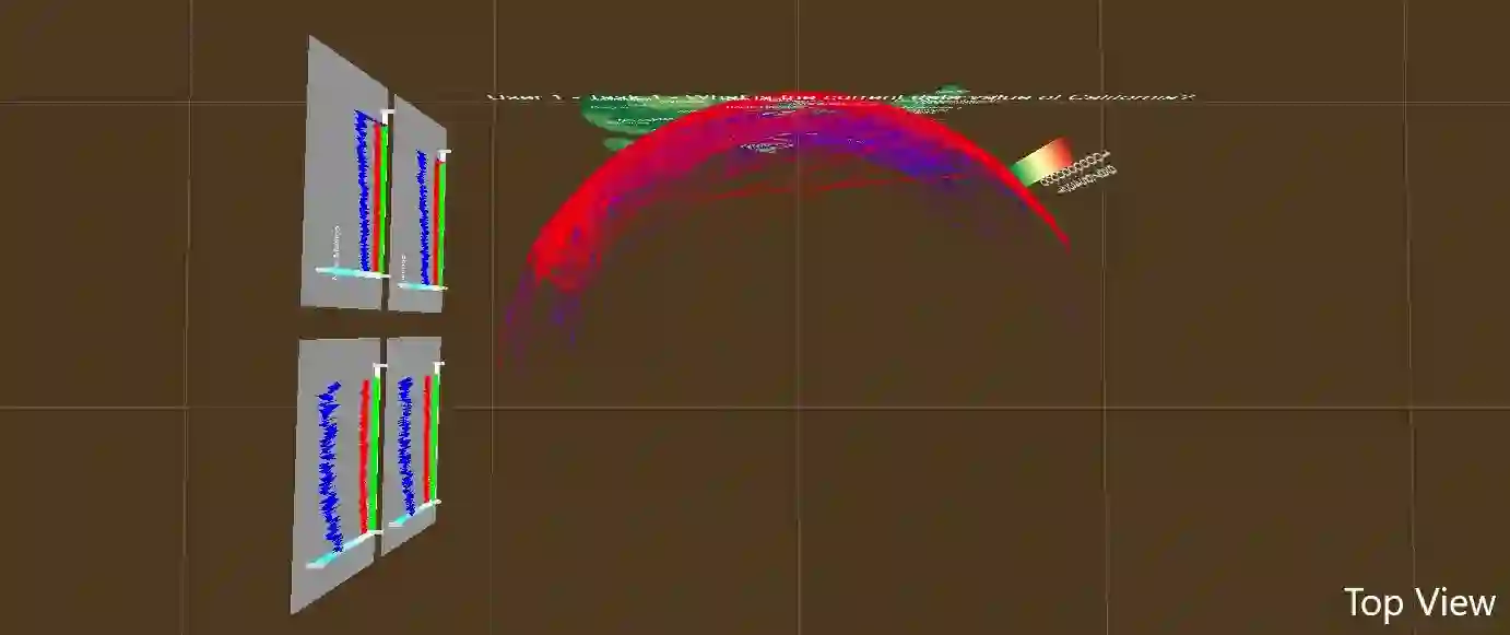
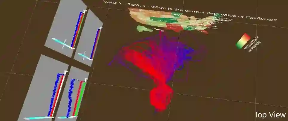
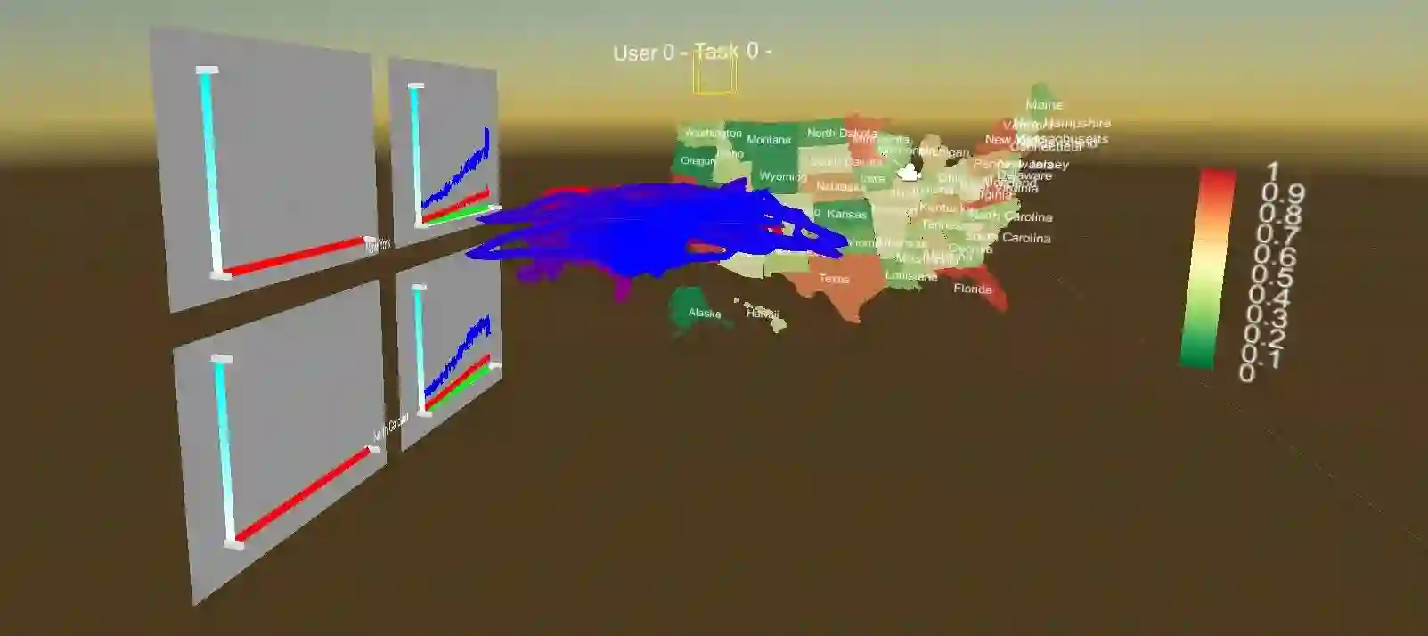
The understanding of visual analytics process can benefit visualization researchers from multiple aspects, including improving visual designs and developing advanced interaction functions. However, the log files of user behaviors are still hard to analyze due to the complexity of sensemaking and our lack of knowledge on the related user behaviors. This work presents a study on a comprehensive data collection of user behaviors, and our analysis approach with time-series classification methods. We have chosen a classical visualization application, Covid-19 data analysis, with common analysis tasks covering geo-spatial, time-series and multi-attributes. Our user study collects user behaviors on a diverse set of visualization tasks with two comparable systems, desktop and immersive visualizations. We summarize the classification results with three time-series machine learning algorithms at two scales, and explore the influences of behavior features. Our results reveal that user behaviors can be distinguished during the process of visual analytics and there is a potentially strong association between the physical behaviors of users and the visualization tasks they perform. We also demonstrate the usage of our models by interpreting open sessions of visual analytics, which provides an automatic way to study sensemaking without tedious manual annotations.
翻译:对可视化分析过程的理解可以从多个方面惠及可视化研究人员,包括改进视觉设计和开发高级交互功能。然而,由于意义构建的复杂性以及我们对相关用户行为知识的匮乏,用户行为的日志文件仍然难以分析。本文针对用户行为的全面数据收集,以及采用时间序列分类方法的分析技术进行了研究。我们选取了经典的疫情数据分析可视化应用场景,并设计了涵盖地理空间、时间序列和多属性的常见分析任务。用户研究收集了用户在桌面与沉浸式两种可比较系统上执行多样化可视化任务时的行为数据。我们通过三种时间序列机器学习算法在两个尺度上总结了分类结果,并探讨了行为特征的影响。研究结果表明,在可视化分析过程中可以区分不同用户行为,且用户物理行为与其执行的可视化任务之间可能存在强关联性。我们还通过解释可视化分析的开放会话演示了模型的应用,为无需繁琐手动标注即可自动研究意义构建提供了可行途径。




相关内容




 微信扫码咨询专知VIP会员