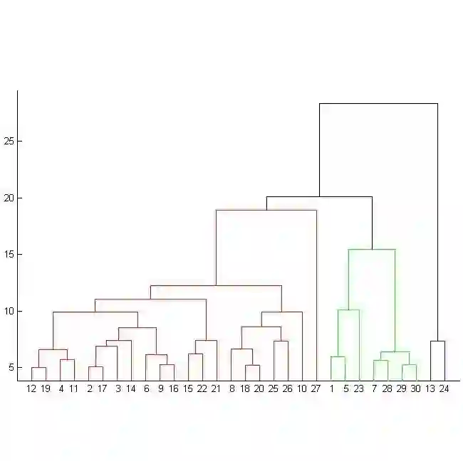
Line-based density plots are used to reduce visual clutter in line charts with a multitude of individual lines. However, these traditional density plots are often perceived ambiguously, which obstructs the user's identification of underlying trends in complex datasets. Thus, we propose a novel image space coloring method for line-based density plots that enhances their interpretability. Our method employs color not only to visually communicate data density but also to highlight similar regions in the plot, allowing users to identify and distinguish trends easily. We achieve this by performing hierarchical clustering based on the lines passing through each region and mapping the identified clusters to the hue circle using circular MDS. Additionally, we propose a heuristic approach to assign each line to the most probable cluster, enabling users to analyze density and individual lines. We motivate our method by conducting a small-scale user study, demonstrating the effectiveness of our method using synthetic and real-world datasets, and providing an interactive online tool for generating colored line-based density plots.
翻译:基于线条的密度图用于减少包含大量独立线条的线图中的视觉杂乱。然而,这类传统密度图常被感知为具有模糊性,阻碍了用户在复杂数据集中识别潜在趋势。为此,我们提出一种新颖的图像空间着色方法,用于增强基于线条的密度图的可解释性。该方法不仅通过颜色直观传达数据密度,还能突出图中相似区域,使用户轻松识别并区分趋势。我们基于穿过每个区域的线条执行层次聚类,并利用圆形多维缩放将识别出的聚类映射到色相环上。此外,我们提出一种启发式方法,将每条线条分配至最可能的聚类,使用户能够分析密度及独立线条。我们通过小规模用户研究验证该方法的动机,利用合成数据集与真实数据集证明其有效性,并提供一个交互式在线工具用于生成彩色化的基于线条的密度图。